20/ Introducing Buried Signals.
Announcing my Youtube channel for data-driven video investigations.
Welcome to the 20th issue of Nuanced.
After 20 months of learning new skills, running a studio, and growing this project I’m making a change.
I've reduced the magazine to a personal blog and am focusing all of my energy into starting… A Youtube channel. From May onwards I’ll be publishing data-driven video investigations every month.
The show is called Buried Signals.
The newsletter will continue to run, but with a different interview format to look into the making of beautfiul visuals and impactful investigations.
The first Buried Signals video is an in-depth look at the conflict in Kashmir, this is an older project so please bear with me as it’s not as data-driven as the next episodes will be.
Inspiration
My favourite project this month is hands-down The Brink by the New York Times.
It scrolls like an animated comic strip, it feels like I’m watching instead of reading and it includes beautiful yet simple data visualizations. In short, it’s remarkable.
Insights
I interviewed Katie Polglase and David Blood from the CNN visual investigations team. Here are 6 learnings from the case study:
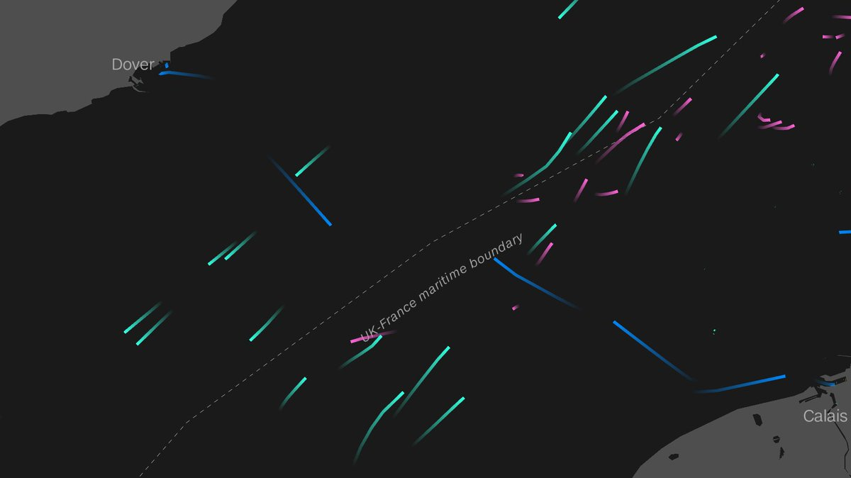
1/ Using open-source data from volunteers was more transparent and efficient than working with local government authorities. Historical data from OpenSky and MaritimeTraffic was used to confirm the location of the drones and ships during the events.
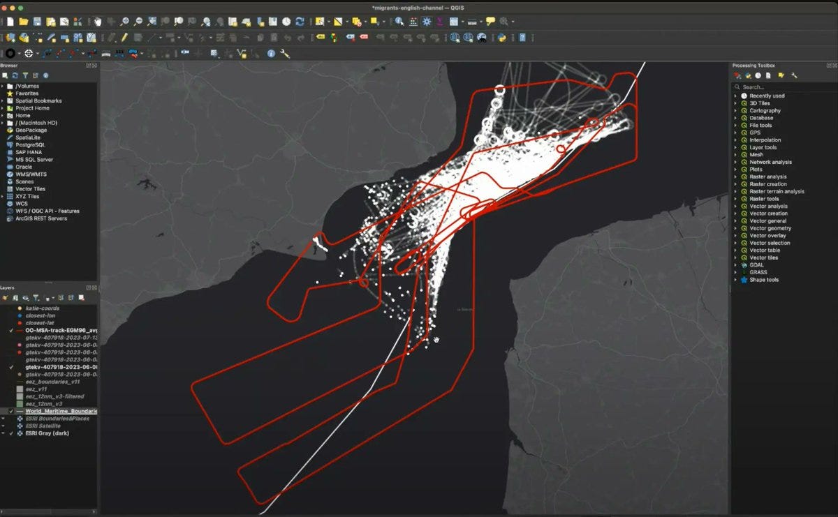
2/ Plotting this data on QGIS they were able to build a forensic reconstruction of the scene minute by minute, to confirm the drone had previously flown within 600m of the WhatsApp location sent by the refugees.
3/ The historical spatial data is animated using DeckGL, which is designed to render large datasets dynamically.
4/ David uses StorybookJS to channel his design and development process, creating a library of reusable elements that his team can reuse. Graphics and interactives are still effort intensive, we should work to reduce that overhead by sharing that work internally to make visuals more accessible.
5/ Document the entire process to make sure you can justify the methodology later.
6/ As technology continues to grow we’ll process ever more spatial data (we all have a LIDAR camera in our pockets), visualisation will become a way to learn new information rather than a presentation tool.
Ending this section with an open question from David - the OpenSky data is in the form of individual pings, has anyone found a way to automate joining the pings into paths?
You can watch the full interview on the blog:
Resources
As always, there’s a lot of AI tools in here, but these are the programs I’m already (or planning to) using so I hope find them helpful.
this case study by the Straits Times on how they rebuilt the Little India riot in 3D
Suno.ai lets you create songs, the technology is quite simply mind blowing.
Numerous.ai brings ChatGPT to Google Sheets
How OSINT researches used satellite data to track war damage in Gaza
Alex Lozano has been publishing an OSINT bible on Linkedin
Thanks for reading!


