9/ Overfishing, NeRFs and TLDRs
Talking about NeRFs and interview insights from the Kontinentalist.
Welcome to Issue 9!
Later this month we’ll be hosting our first online meetup to talk about photogrammetry and NeRFs, you can apply to join here.
In a minor pivot earlier this month I decided to focus the efforts of Buried Signals on curating only visual narratives (information design and data visualization in the context of a story), this aligns more fully with our long-term goals to empower independent journalism with tools and knowledge for interactive storytelling. You can read more about our mission here:

Visual Spotlight
This month's visual Spotlight goes to Fishing the Feed by Fiasco Design and Changing Markets. The visual narrative uses 3D and illustration to immerse readers into the dark side of fishing, demonstrating it's consequences on our oceans in a format reminiscent of a bedtime story.
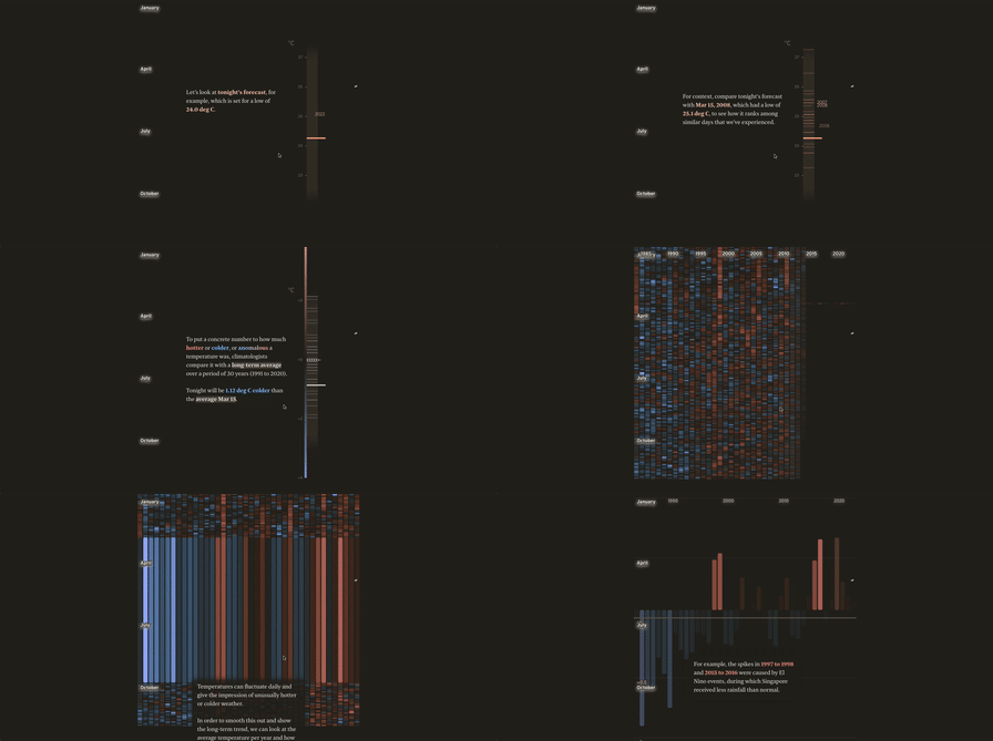
A special shoutout to the Straits Times for a mind-bending article on heat in Singapore. The finely crafted animated transitions between infographics are particularly satisfying, so is the attention to detail in every aspect (there’s a lot to unpack).
Insights
Next month I’ll be publishing the first of a series of articles about impactful narrative visualization, consolidating insights from data storytelling books and academic research analyses. Once the series is complete I’ll be proposing an article framework for review.
Earlier this month I had the pleasure of interview Peiying from the Kontinentalist, their data stories are unique with average read times of up to 14 minutes! Here are a few takeaways from the interview :
Viewership isn't as important to us as what people take away from the story and the visuals. Which is why we measure our success by read time, aiming for at least a four to five minutes.
Our pieces with the longest read time are those that add the most meaning to a conversation, they add unique research and use data to demystify certain narratives and ideas (example).
We ran A/B tests to see if people cared about having bullet point summaries at the top of our stories, the conclusion was that for visual stories they don't and instead prefer to scroll through.
When looking at possible visualizations, we challenge ourselves with the following questions: is it understandable within thirty seconds? What is the key message? Is it the most sensitive way to present data?
We find that if you distill your visualization to a single sentence it provides a very clear picture of what would be the best solution to achieve that message.
Stay tuned next week for our latest interview with Russell Samora from the Pudding!
Handpicked obsessions
Fortnite is en route to becoming the Metaverse, Epic Games releases Unreal for Fortnite


