Inspiration
A repository of data-driven visual stories from around the world, humanising complex issues with design and technology.

Dataviz
How five of the worst schools in Florida wound up in Pinellas County
How this happened, in 24 charts.

Dataviz
Is data neutral?
Le Monde dissected the code of the algorithm used to calculate the 'risk score' of social benefit recipients – their supposed likelihood of committing fraud, based on characteristi...

Dataviz
Multimedia
How a Koch-owned chemical plant in Texas gamed the Clean Air Act
Oxbow Calcining spent years running from clean air rules. New evidence suggests it bent the law until it broke.

Multimedia
A year of the Shahed
How Iranian drones became a key tool in Russia's arsenal

Multimedia
Despite lawsuit, Casino Group still sells beef from an Amazonian Indigenous land
A new investigation shows that farms located in the Uru-Eu-Wau-Wau Indigenous Territory in the Brazilian Amazon supplied two JBS meatpacking plants that sell beef to brands of the ...

Illustration
Ben Jennings | The Guardian
Ben Jennings is an award-winning cartoonist/illustrator. Prints of his Guardian cartoons are available here.

Interactive
Let's Learn About Waveforms
An interactive guide that introduces and explores waveforms.

Multimedia
Ghosts on the Glacier
Decades after the unexplained deaths of two American climbers in Argentina, a camera belonging to one of them was found in the snow. The film held astonishing images, but the myste...

3D
Dataviz
【最新圖解】中國衛星發到家門口
載運飛彈的火箭,也是送低軌衛星上太空的運具。2024 年初國家警報一響,正式打響兩岸情勢、中美角力前哨戰。低軌衛星是什麼?它為何重要?

Dataviz
Mietpreise in Deutschland : So teuer sind die Mieten in Ihrer Stadt im Deutschland-Vergleich
Unsere interaktive Karte zeigt, wie sehr die Mieten in Städten gestiegen sind und wo sie sich von Löhnen entkoppelt haben. Schlecht steht es um Sylt. Ganz gut um München.
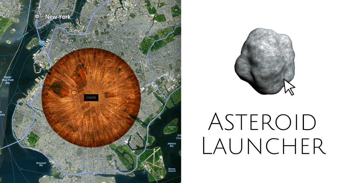
Interactive
Asteroid Launcher
An asteroid simulator that lets you design your own asteroid and launch it at Earth. Simulate the effects of an asteroid impact on Earth's population.
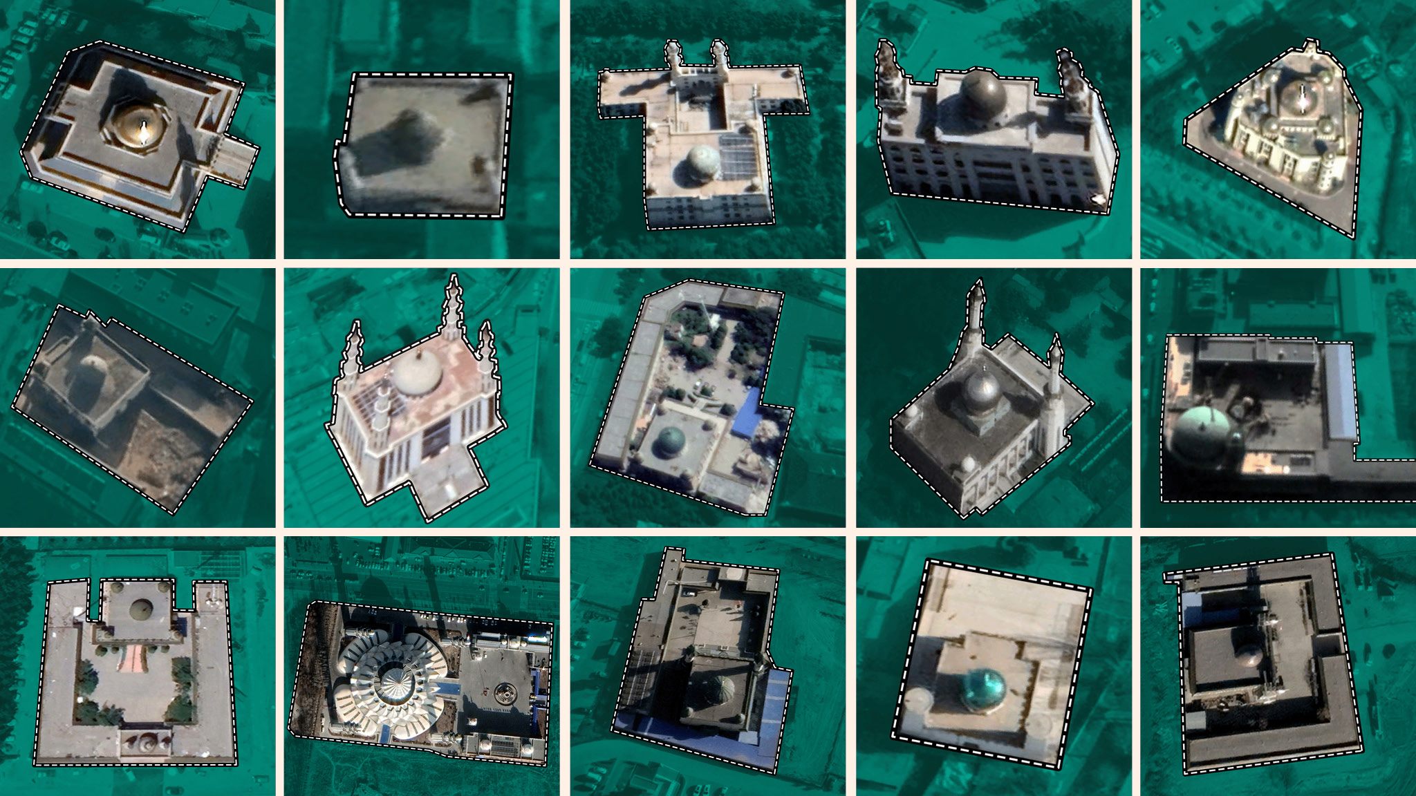
Maps
How China is tearing down Islam
Thousands of mosques have been altered or destroyed as Beijing’s suppression of Islamic culture spreads

Maps
Wind Farms Are Overstating Their Output — And Consumers Are Paying For It
Some of Europe’s biggest energy firms are overstating how much wind power they’ll add to the UK’s creaking grid — receiving millions to flick the off switch.
Inspiration of the Month

Documentary
Beneath the Rubble
A new report, digital multimedia feature, and 22-minute video analyze the civilian suffering and damage to thousands of buildings, including several hundred high-rise apartments, h...

Interactive
Dataviz
30 Years of American Anxieties
What 20,000 letters to an advice columnist tell us about what—and who—concerns us most.
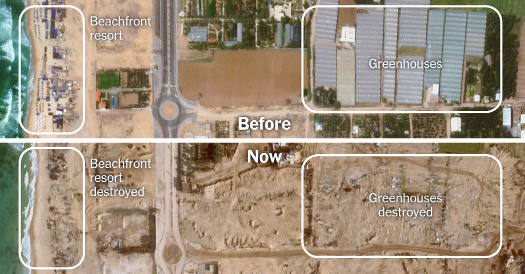
Maps
Gaza After Nine Weeks of War
After Israel’s invasion and thousands of strikes, many neighborhoods lie in ruins. Videos, photos and satellite imagery show how much has been destroyed.

Maps
Révélations sur la contamination massive de l’Europe par les PFAS, ces polluants éternels
Présentes dans une multitude d’objets, des poêles antiadhésives aux implants médicaux, les PFAS sont des substances chimiques toxiques et quasi indestructibles. « Le Monde » dévoil...

Multimedia
The Year, Explained: 2024
A look ahead from The Explainer Studio

Multimedia
Documentary
Les Mémos de la Terreur
Disclose a obtenu plusieurs centaines de documents secrets qui révèlent la responsabilité de la France dans les crimes de la dictature d’Abdel Fattah Al-Sissi, en Egypte.

Dataviz
Maps
NBA All-Star Weekend Data Visualization
In our latest data visualization, we delved into the intricate ways that Zartico's data enriches the understanding of expenditure patterns and mobility trends…
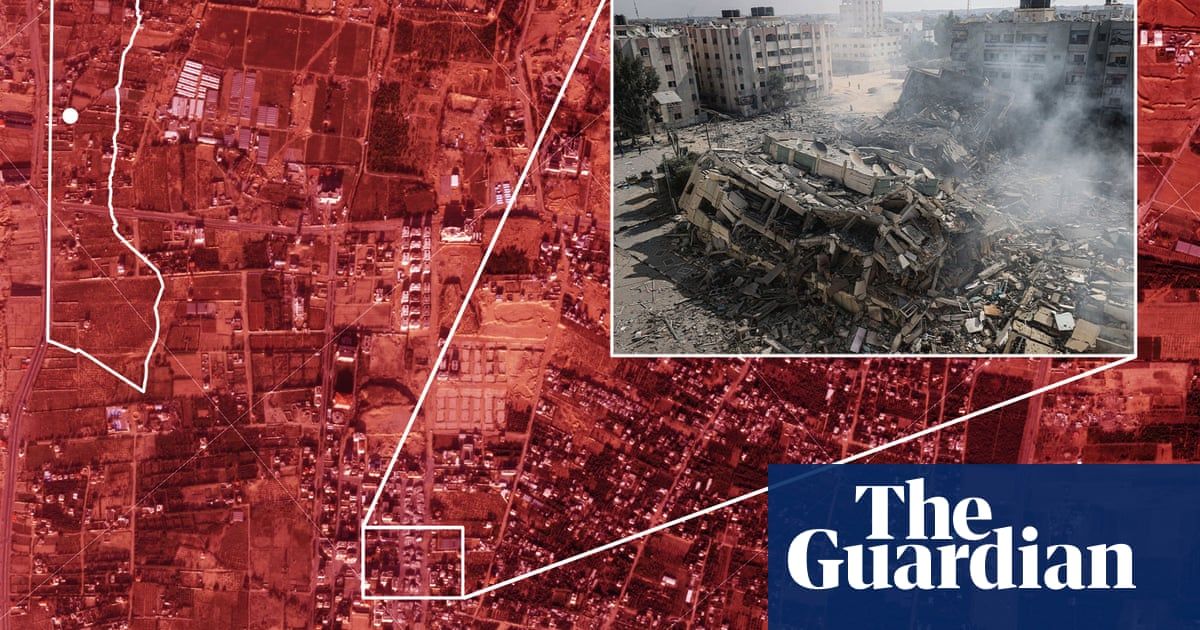
Maps
How war destroyed Gaza’s neighbourhoods – visual investigation
Satellite imagery and open-source evidence lay bare the destruction to civilian infrastructure by Israel in its war on Hamas
Maps
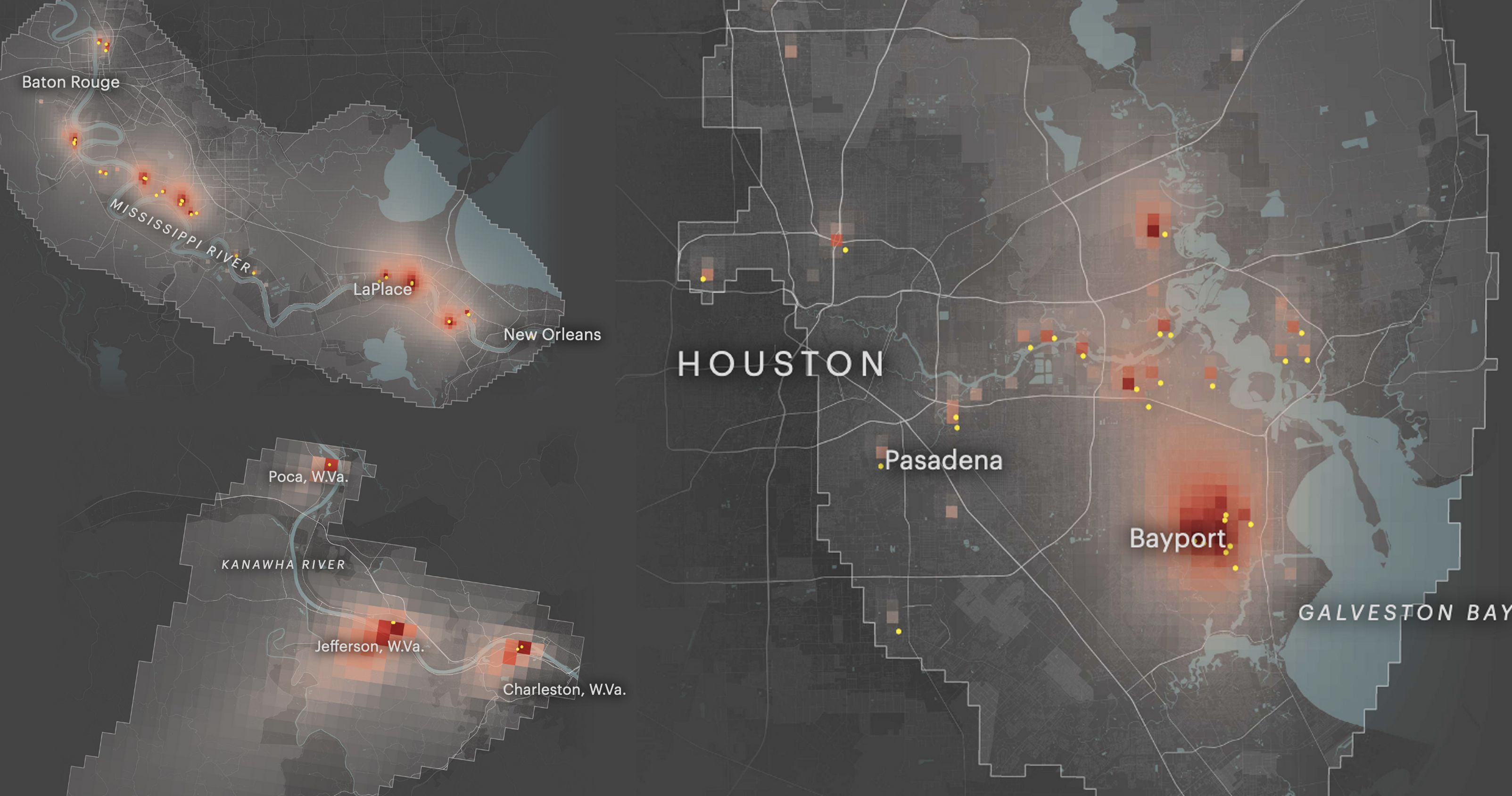
The Most Detailed Map of Cancer-Causing Industrial Air Pollution in the U.S.
Using the EPA’s data, we mapped the spread of cancer-causing industrial air emissions down to the neighborhood level. Look up your home to see if you and your loved ones are living...
Maps
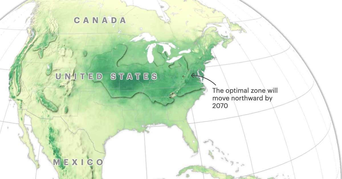
New Climate Maps Show a Transformed United States
According to new data analyzed by ProPublica and The New York Times Magazine, warming temperatures, rising seas and changing rainfall will profoundly reshape the way people have li...
Dataviz
Asia Pacific Migration Statistics | IOM RDH
Migration statistics for Asia Pacific, unveiling migration flows, remittances, types of migration and more with visually rich maps and charts.